Sketch London
Industry: Hospitality
Verdict: “Twenty years of cultural history, stored almost nowhere online.”
Reviewed: April 2026
Who They Are
Sketch is a Mayfair destination occupying a Grade II listed 1779 James Wyatt building on Conduit Street. Founded in 2002 by restaurateur Mourad Mazouz and three-Michelin-starred chef Pierre Gagnaire, it operates as five distinct rooms under one roof: the Parlour (casual all-day dining), the Gallery (afternoon tea, redesigned by India Mahdavi in its signature pink), the Lecture Room and Library (fine dining, three Michelin stars), the East Bar, and the Glade. Over two decades, the space has hosted rotating art installations by Martin Creed, David Shrigley, India Mahdavi, and Yinka Shonibare. The brand describes itself as participatory, inviting guests to “make sketch yours” through interactive elements like designing neon signs and carpet patterns. Creative Director Sylvain Chevelu has steered the brand’s visual identity for twenty years.
What We Noticed
The Archive That Does Not Exist
Sketch has collaborated with some of the most significant artists working in Britain over the past two decades. Martin Creed, David Shrigley, India Mahdavi, Yinka Shonibare: this is a serious cultural programme. Almost none of it is documented on the website. There is no artist timeline, no archive of past installations, no record of how each collaboration shaped or reshaped the rooms. For a brand whose entire identity rests on the intersection of food, art, and design, this is a remarkable gap. Twenty years of cultural history lives in press clippings, Instagram posts, and the memories of people who happened to visit during a particular installation. The brand is sitting on a cultural archive that most galleries would envy, and it is not telling the story.
Five Rooms, One Website
Each of Sketch’s five rooms has a distinct identity, a distinct audience, and a distinct price point. The Parlour and the Lecture Room serve fundamentally different purposes. In the physical space, this is obvious: you walk through a door and the world changes. Online, the rooms are compressed into a navigation structure that prioritises reservations and operational information. The spatial storytelling that makes Sketch remarkable in person, the feeling of moving between worlds, does not translate to the digital experience. There is no dedicated room page that lets a first-time visitor understand what the Gallery feels like, what the Lecture Room sounds like, why the East Bar exists in the specific way it does. The rooms deserve individual digital identities as carefully considered as their physical ones.
The Cocktail Programme Is Invisible
Sketch’s bar programme, led by Martino Franchi, is a significant part of the brand. Cocktail culture in London is increasingly content-driven, with bars like Connaught Bar and Tayerand building digital followings around their drink menus. Sketch’s cocktail offering, which sits within one of the most visually distinctive bar environments in the city, has almost no digital visibility. The drinks are not photographed, not storied, not positioned as part of the wider creative programme. In a competitive set where Chiltern Firehouse leads with celebrity lifestyle and Bacchanalia with Damien Hirst spectacle, Sketch’s natural advantage is the depth and seriousness of its creative output. The cocktail programme is part of that output, but it is not being presented as such.
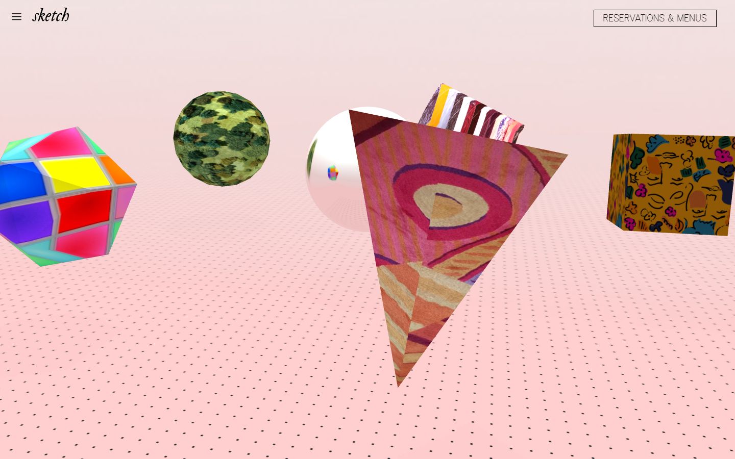
The 3D Homepage Problem
The current website features a distinctive 3D interactive homepage that is playful and technically interesting. It communicates that Sketch is not a conventional restaurant. What it does not do is orient a first-time visitor. Someone arriving at sketch.london to understand what the place is, whether they should book for afternoon tea, and what the price range looks like has to work harder than they should. The homepage is a statement piece. The rest of the website needs to be a guide.
What Works
Sketch’s cultural positioning is genuinely rare. There is no other hospitality venue in London, possibly in Europe, that has maintained a twenty-year programme of artist collaborations at this level. The India Mahdavi Gallery, with its pink velvet banquettes and egg-shaped bathroom pods, has become one of the most photographed interiors in Britain. This is earned cultural capital. It cannot be bought or replicated quickly, and it gives Sketch a moat that competitors like Bacchanalia (opened 2023, Damien Hirst partnership) will take years to approach.
The participatory brand concept, “make sketch yours”, is also smart. It positions the venue as a co-created experience rather than a passive consumption one. The five-room structure, offering everything from a casual pastry to a three-Michelin-star tasting menu, means Sketch can serve wildly different audiences without diluting the brand. Few hospitality brands manage this range without losing coherence.
The Wider Pattern
The gap between physical experience and digital presence is the defining tension we keep encountering across hospitality brands. Sketch is the most extreme example. This is a venue where the physical space is so extraordinary that it has generated over two decades of press coverage, social media virality, and cultural commentary, essentially for free. The website, meanwhile, functions primarily as a reservation tool.
We see the same pattern at House of Gods, where maximalist interiors and theatrical brand voice are paired with a website that communicates mood without building narrative. Both brands have invested deeply in what the guest sees and feels when they walk through the door. Neither has made the equivalent investment in what the guest sees and feels when they open a browser tab. The difference is one of degree: House of Gods has the aesthetic online but not the conversion architecture; Sketch has the cultural weight but not the storytelling infrastructure.
This is not unique to luxury hospitality. Across the brands we are reviewing, from Tortilla to Hub Box, the pattern holds. Physical brand identity outpaces digital brand identity. The website is the last thing to receive the same creative attention as the dining room or the lobby. For brands competing increasingly on discovery, content, and organic reach, this is a strategic gap, not a cosmetic one.
If We Were Starting Fresh
Sketch does not need a rebrand. It does not need a new visual identity or a revised tone of voice. What it needs is a digital presence that reflects the depth and seriousness of what happens inside the building. The website should feel like walking through the rooms: each space with its own world, its own story, its own reason to exist. The twenty-year archive of artist collaborations should be visible and navigable. The cocktail programme, the chef’s philosophy, the building’s history as a Grade II listed James Wyatt townhouse: all of this is material that builds cultural authority online. The goal would be to make sketch.london feel like a destination in itself, a place people visit to understand the brand, not just to make a reservation.
Want Us to Review Your Brand?
We will analyse your visual identity, website, and competitive position, then publish our findings. You get early access 48 hours before it goes live.
Wondering if YOUR brand has the same gaps?
We will tell you -- for free. Our team will analyse your website and brand, then send you an honest review.
Get Your Brand ReviewFeature Your Review
Display this badge on your website to showcase your independent brand review.

