Maison Flaneur
Industry: Retail & DTC
Verdict: “A marketplace named after an explorer that does not invite you to explore.”
Reviewed: April 2026
Who They Are
Maison Flaneur is a curated online homeware marketplace that brings together independent designers from around the world. The collection spans hand-painted ceramics, sculptural lighting, bold textiles and design-led furniture — pieces chosen for their character rather than their category. The brand takes its name from the French concept of the flaneur, the leisurely urban explorer who walks without destination, finding beauty in the unexpected. The marketplace ships across the EU and US, connecting buyers with artisans they would otherwise never encounter. Each piece carries the mark of its maker — hand-finished, limited in production, distinct from the mass-manufactured homogeneity that dominates the interiors market.
What We Noticed
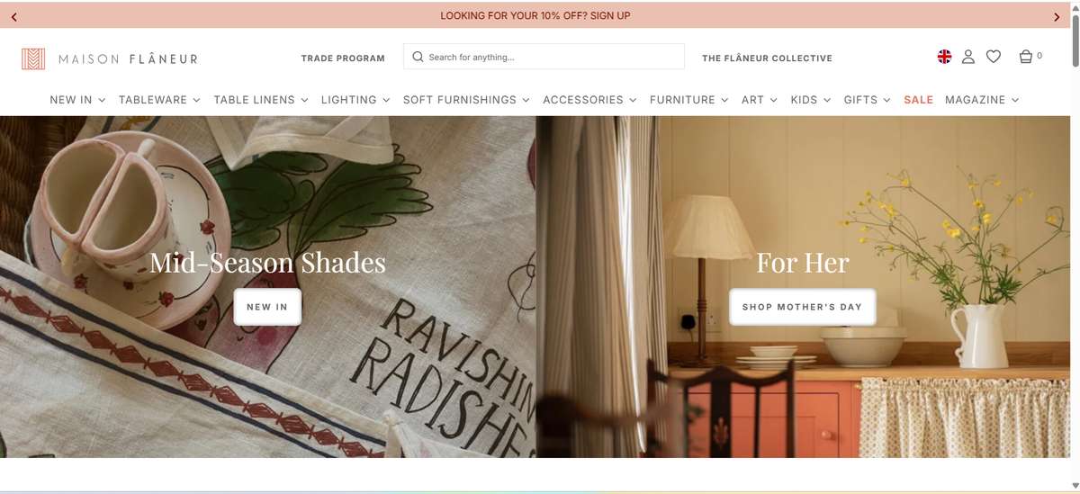
The explorer blocked at the door
The flaneur concept is about unhurried discovery — wandering into something beautiful without being told where to go. The first thing visitors encounter on Maison Flaneur’s website is a country selector overlay. Before you see a single product, a single maker, a single image, you must choose your shipping destination. This is a functional requirement, certainly — different countries mean different shipping rates and availability. But structurally, it means the brand named after spontaneous exploration begins with a form. The flaneur does not fill in forms. The flaneur drifts. The very first interaction contradicts the brand’s founding metaphor.
Maker stories behind locked doors
The makers are the marketplace’s competitive advantage. Each artisan — the ceramicist in Portugal, the glassblower in Murano, the textile artist in Morocco — has a story that gives their work context and value. Those stories exist on the site, but they are hidden behind navigation layers. You have to know to look for them. The homepage prioritises a product grid — thumbnail images, prices, add-to-cart buttons — which is exactly how Amazon presents its marketplace. The difference between Maison Flaneur and a commodity marketplace is the curation, the intention, the human stories behind each piece. But the site structure treats those stories as supplementary rather than essential.
Products without companions
Every piece in the Maison Flaneur collection was chosen because someone believed it belonged alongside other pieces in the collection. That curatorial logic — these things go together, this aesthetic connects to that one — is invisible on product pages. There is no cross-sell mechanism, no “from the same maker” suggestion, no “pairs well with” editorial curation. A customer who finds a hand-painted ceramic bowl has no natural pathway to the sculptural candle holder from the same artisan, or the textile piece that shares the same colour story. Each product exists in isolation, which is the opposite of how a curated collection should feel.
What Works
The product selection itself is the core asset. Maison Flaneur has assembled a collection of independent makers that you genuinely cannot find in one place anywhere else online. The hand-painted ceramics, the sculptural lighting, the artisan textiles — these are not products you stumble across on mainstream homeware sites. The curation is real, not performed.
The brand name and concept are memorable and distinctive. “Flaneur” is not just a name — it is a positioning philosophy. It implies leisure, taste, curiosity, discovery. In a homeware market dominated by functional brand names, Maison Flaneur immediately signals a different kind of shopping experience.
The international scope of the maker network is impressive. Sourcing from artisans across multiple countries and continents creates a breadth of aesthetic range that single-origin brands cannot match. It also gives each piece a provenance story that adds value beyond the physical object.
The photography across the site is consistent and high-quality. Products are well-lit, shown from multiple angles and presented in a way that communicates craftsmanship. The visual standard meets the premium positioning the brand aims for.
The Wider Pattern
We see a version of this tension in almost every curated marketplace and boutique we review. Tomfoolery London curates 50-plus independent jewellery designers but presents them through product carousels that could belong to any online retailer. Grind built a coffee brand on curatorial credibility — sourcing, roasting, Shoreditch origins — but leads with discount codes. The pattern is consistent: the act of curation, which is the entire value proposition, becomes invisible in the digital experience.
For marketplaces specifically, the risk is higher. A marketplace without visible curation is just a shop with multiple suppliers. The stories, the relationships, the editorial voice that explains why this maker and not that one — these are what separate a curated marketplace from a directory. When the site structure hides these elements, the brand loses its reason for existing and competes on product and price alone, which is a contest it will always lose to larger players.
If We Were Starting Fresh
We would rebuild the homepage around maker-led discovery. Instead of a product grid, visitors would encounter artisan spotlights — short, visual introductions to the makers behind the collection. Who is this ceramicist in Portugal? Why does this glassblower in Murano work the way she does? What connects these pieces to each other? The flaneur concept would become the navigation logic — wandering through stories, not categories.
The country selector would move from an overlay to an inline element. A small flag, a dropdown in the header, something that handles the functional requirement without blocking the experience. The first thing a visitor sees should be beauty, not logistics.
Cross-sell mechanisms on product pages would follow curatorial logic rather than algorithmic recommendation. “From the same maker,” “shares a colour story with,” “often styled alongside” — editorial connections that reflect the taste behind the collection rather than purchase data.
The maker stories would move to the surface. Not buried in an About section or a dedicated Makers page, but woven throughout the shopping experience. On product pages, in homepage features, as a persistent editorial layer that reminds visitors at every turn: someone chose this, for a reason, and that reason is part of what you are buying.
Maison Flaneur has the concept, the name, the makers and the collection. The digital experience just needs to let the flaneur do what flaneurs do — wander, discover and fall in love with something unexpected.
Wondering if YOUR brand has the same gaps?
We will tell you -- for free. Our team will analyse your website and brand, then send you an honest review.
Get Your Brand ReviewFeature Your Review
Display this badge on your website to showcase your independent brand review.

