Bodykind
Industry: Wellness
Verdict: “Twenty years of curating natural products, displayed through a website that looks five years old.”
Reviewed: April 2026
Who They Are
Bodykind has been curating natural health and beauty products since 2004. Unlike marketplace retailers that stock anything with “natural” on the label, Bodykind applies a rigorous selection process to every brand and product in its catalogue — evaluating ingredients, efficacy claims and ethical credentials before anything reaches the virtual shelf. Over 20 years, this curatorial discipline has built a catalogue that customers trust precisely because not everything makes the cut. The brand competes with Holland & Barrett on the high street, Planet Organic at the premium end and Ethical Superstore on breadth. But Bodykind’s positioning is distinct from all three: it is the trusted curator, the editorial voice that does the research so the customer does not have to. Two decades of that consistency is a competitive asset that no new entrant can replicate.
What We Noticed
The Framework Fossil
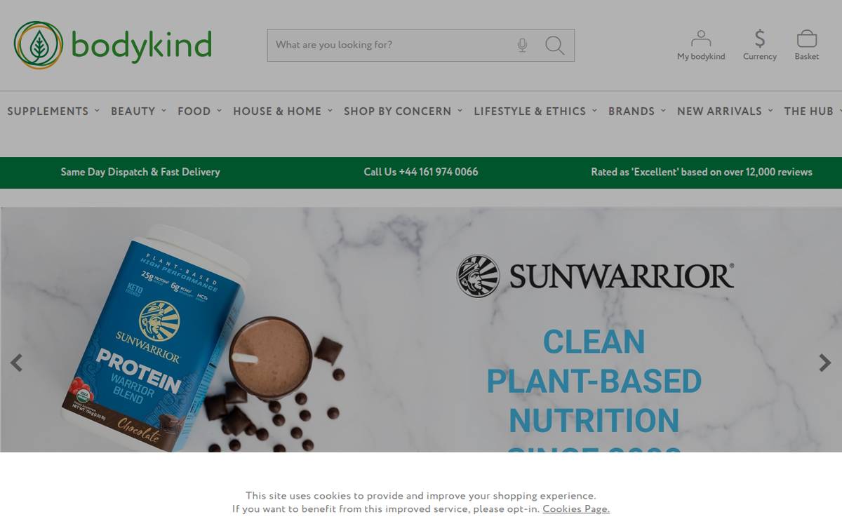
The website runs on Bootstrap — a front-end framework that was revolutionary in 2013 and became the default for responsive web design in the mid-2010s. A decade later, it is immediately recognisable to anyone who has spent time looking at websites built during that era. The typography, the grid system, the button styles, the card layouts — they all carry the visual fingerprint of a specific period in web design. This is not inherently a problem for every business, but for a brand whose core proposition is curatorial authority, the visual age of the platform directly undermines the brand promise. A customer who trusts Bodykind to curate the best natural products is also, unconsciously, evaluating whether the brand has the judgment and taste to be trusted. A website that looks five years old introduces doubt where there should be confidence.
The Desktop-Mobile Divide
The desktop experience, while dated, is functional. Products are browsable, categories are navigable, and the information architecture does the basic job of connecting customers with products. On mobile, the experience deteriorates significantly. Product grids that work adequately on a wide screen become cramped and difficult to navigate on a phone. Typography that is readable at desktop scale becomes small or awkwardly spaced on mobile. Touch targets are inconsistent. The checkout flow requires more effort than modern mobile shoppers expect. This matters because the majority of natural beauty browsing and purchasing now happens on mobile devices. A brand that is difficult to shop on a phone is losing customers at the point of maximum intent — they have searched, they have arrived, and the experience pushes them away.
The Invisible Curation
Twenty years of rigorous product selection is Bodykind’s defining competitive advantage. The process of evaluating brands, testing products, checking ingredient lists and making the editorial decision about what meets the standard — that process is the brand. Yet it is almost entirely invisible on the website. There is no content that shows the selection criteria in action. No profiles of brands that were accepted and why. No stories about products that were rejected and what that reveals about Bodykind’s standards. The curation happens behind the scenes, and the customer only sees the result — a product grid that looks identical to any other natural beauty retailer’s product grid. The difference between Bodykind and a marketplace that stocks everything is the editorial judgment. If that judgment is invisible, the difference is invisible too.
What Works
The product catalogue itself reflects 20 years of genuine curation. The brands stocked are consistently high-quality, and the range covers natural health and beauty without sprawling into irrelevant categories. Bodykind’s product descriptions are informative, with clear ingredient information and honest assessments of what each product does. The brand carries a credibility with its customer base that comes from two decades of consistent selection standards — regulars trust the catalogue because the catalogue has earned that trust over time. The search functionality is adequate, and the category structure is logical enough to navigate. Customer reviews are present and appear genuine, which adds a layer of social proof that supports the curatorial authority. The range includes niche brands that are difficult to find elsewhere, which gives loyal customers a reason to return rather than defaulting to Holland & Barrett. The pricing is transparent, with no hidden costs or surprise shipping charges.
The Wider Pattern
Across the retailers and curators we have reviewed, the brands with the strongest editorial positions often have the weakest digital expressions of that position. The curation happens in the buyer’s head, in the evaluation process, in the years of relationship-building with suppliers — and none of that is visible to the customer on the website. What the customer sees is a product grid that could belong to any retailer.
The White Company, which we reviewed recently, faces a version of this tension — 30 years of building an accessible luxury brand, now presented through a homepage dominated by clearance banners and promotional messaging. Lush has the deepest ethical commitment in beauty and the weakest digital expression of it. The pattern is consistent: the brands that have done the hardest work — building genuine authority, earning genuine trust, curating with genuine rigour — are the ones whose websites least reflect that effort.
For Bodykind specifically, the mobile dimension adds urgency. Holland & Barrett has invested heavily in its digital experience. Planet Organic has rebuilt its e-commerce platform. The competitive set is moving, and a Bootstrap-era website that underperforms on mobile is falling further behind with every month that passes. The curatorial authority is real. The platform is holding it back.
If We Were Starting Fresh
We would make the curation visible. The homepage would not lead with a product grid — it would lead with the editorial perspective that determines what belongs in the grid. “Trusted since 2004” is a start, but the trust needs to be demonstrated, not just claimed. Featured selections with editorial commentary explaining why these products made the cut. Brand profiles that tell the story of the partnership. An “ingredients we refuse to stock” section that makes the selection criteria tangible. The curation process is the brand, and the website should put that process at the centre of the experience.
The mobile experience would be rebuilt from the foundation. Not responsive adjustments to a desktop layout but a mobile-first design that treats the phone as the primary shopping device. Large touch targets, generous spacing, fast-loading product images, a checkout flow that requires minimal effort. The majority of natural beauty shoppers are browsing on phones. The experience needs to meet them there.
The visual identity would be modernised without losing the warmth and trust that 20 years of consistency have built. This does not mean chasing trends — it means establishing a typographic and visual language that communicates “authoritative curator” rather than “mid-2010s e-commerce.” Clean, confident, editorial. The kind of design that says “we know what we are talking about” before the customer reads a single word of content. Bodykind has earned that authority. The website should reflect it.
Wondering if YOUR brand has the same gaps?
We will tell you -- for free. Our team will analyse your website and brand, then send you an honest review.
Get Your Brand ReviewFeature Your Review
Display this badge on your website to showcase your independent brand review.

