Price Bailey
Industry: Professional Services
Verdict: “A top 40 firm with a website that could belong to any of the other 39.”
Reviewed: April 2026
Who They Are
Price Bailey LLP is a chartered accountancy firm founded on 1 April 1938 in Bishop’s Stortford. Eighty-seven years later, it is a top 40 UK practice operating from more than 13 locations — Cambridge, Norwich, London (multiple offices), Oxford and Dubai among them. The firm covers audit, tax, corporate finance, advisory, employment law, insolvency, valuations and personal services, with sector specialisms spanning agriculture, gaming, life sciences, media, not-for-profit, real estate and technology. Price Bailey won Corporate Finance Advisory Firm of the Year at the 2025 Central & East Dealmakers Awards and holds IAPA and APA network memberships for international reach. The firm’s slogan is “The right advice for life” — a claim that implies permanence, trusted counsel and long-term relationships. Against Menzies LLP, Haysmacintyre and Crowe UK, Price Bailey competes on geographic strength (East Anglia dominance), sector breadth and a thought leadership programme that is more consistent than most firms of its size.
What We Noticed
The template beneath the substance
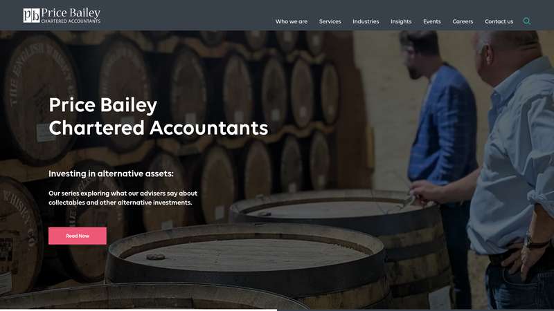
Price Bailey’s website is clean, professional and well-built. Volte typeface. White and dark backgrounds with a pink accent (#ed5876) that provides a flicker of personality. Grid layouts, service dropdowns, insights hub, award logos, contact forms. Every element works. And every element is precisely what you would find on any other top 40 accountancy firm’s website. The visual system does not communicate anything about Price Bailey specifically. It communicates “accountancy firm” generically. Remove the logo and you could not identify which firm you were looking at. This is not a criticism of the design quality — it is a criticism of the design ambition. The website has been built to be correct rather than distinctive.
Eighty-seven years of silence
Price Bailey was founded in 1938. It has survived the Second World War, the digitalisation of accounting, the consolidation waves that merged dozens of independent practices into larger groups, and the emergence of cloud accounting platforms that threatened to commoditise the profession. This is not just history — it is proof of adaptability, client loyalty and institutional resilience. And the website says almost nothing about it. No founding narrative. No timeline. No articulation of what 87 years of independence means for a client choosing an adviser today. In a profession where trust is the product, heritage is evidence. Price Bailey has the evidence and declines to present it.
Content infrastructure without content identity
The thought leadership programme is genuinely impressive in its consistency. Blog posts, guides, reports, ebooks, videos, podcasts, infographics — published regularly, covering real client issues from BPR/APR changes to academy finance to media agency accounting. A dedicated Content Executive collaborates with partners to maintain output. This is the content infrastructure that marketing directors at professional services firms dream about. But the content sits inside a visual and editorial system that does not amplify it. Every article looks the same. Every guide follows the same layout. The content is specific and useful; the container it lives in is generic and forgettable. The infrastructure is built. The identity is not.
Depth that requires excavation
Price Bailey serves 16+ industries. This is genuine sector expertise, not a marketing claim — you do not maintain 16 active sector pages without the people to back them up. But the site presents this depth through dropdown menus and service grids that flatten the hierarchy. Agriculture and gaming receive the same visual treatment. Life sciences and personal services occupy the same template. The firm’s depth is real, but the website treats every sector as equally important, which means none of them feel distinctively important. A client in life sciences cannot tell, from the homepage, that Price Bailey has specific expertise in their sector. They must click, navigate and discover. The depth is there. The surface does not reveal it.
What Works
The content programme is the standout asset. Regular publishing across multiple formats, with a dedicated team producing sector-specific material — this is rare among firms outside the top 20. The content is strategically targeted to client pain points rather than generic commentary, which means it serves both SEO and credibility functions simultaneously.
The geographic footprint is genuinely distinctive. East Anglia dominance plus London, Oxford and Dubai creates a network that is hard for competitors to replicate. This is structural advantage, not marketing positioning.
The pink accent colour, while subtle, is the one visual element that provides any brand recognition. It is not enough on its own to create distinctiveness, but it is a foundation that a stronger visual identity could build on.
The 2025 Dealmakers Award signals genuine corporate finance capability. The IAPA/APA memberships provide international credibility for clients with cross-border needs.
The firm’s slogan — “The right advice for life” — is, for a professional services tagline, better than average. It implies long-term relationships rather than transactional engagements, which aligns with the kind of advisory practice the firm appears to be.
The Wider Pattern
The accountancy profession has a visual identity crisis. Across the firms we have reviewed, the pattern repeats: genuine expertise, consistent content, real sector depth — all presented through websites that are functionally interchangeable. Saffery, a firm whose insight articles genuinely outperform its homepage, wraps authoritative content in a dated visual system. Wedlake Bell, a law firm with distinctive niche practices, buries its differentiators under a dense navigation structure.
The problem is industry-wide, not firm-specific. When every accountancy firm uses the same visual language — clean grids, trust logos, service category menus, insights hubs — the result is a sector where brand recognition is almost impossible to build online. Clients choose accountants through referrals and relationships, and the websites confirm this by being designed for validation rather than differentiation. But validation and differentiation are not mutually exclusive. A firm can be professionally credible and visually distinctive. It just requires the ambition to look different from the other 39 firms in the top 40.
If We Were Starting Fresh
We would build the visual identity from Price Bailey’s two strongest assets: the 87-year heritage and the sector depth. The homepage would tell the founding story — not as nostalgia, but as proof. A firm that has survived 87 years of disruption has earned something that no amount of marketing spend can buy: evidence of adaptability. This narrative would frame every service, every sector page and every piece of content.
The sector expertise would move from dropdown menus to the homepage. Not all 16 sectors — the five or six where Price Bailey’s expertise is deepest and its competitive advantage clearest. Agriculture in East Anglia. Life sciences in Cambridge. Gaming. These are specific, defensible positions. They deserve visual prominence, distinctive sector identities and content that demonstrates authority rather than just listing services.
The visual system would be rebuilt to make the content programme feel as distinctive as it deserves. The pink accent is a starting point. A fuller identity — distinctive typography, a colour system that differentiates sectors, layouts that break the grid template — would give Price Bailey’s substantial content output a home that signals quality before you start reading. The firm has done the hard work. The website just needs to stop making it look easy — or worse, generic.
Wondering if YOUR brand has the same gaps?
We will tell you -- for free. Our team will analyse your website and brand, then send you an honest review.
Get Your Brand ReviewFeature Your Review
Display this badge on your website to showcase your independent brand review.

