Bleach London
Industry: Hospitality
Verdict: “East London’s colour revolution, with a website split between salon bookings and product shopping that serves neither fully.”
Reviewed: April 2026
Who They Are
Bleach London started in the way that the best east London brands tend to start: in someone’s flat, with friends, and without a business plan. The founders began mixing hair colours at the kitchen sink — literally — and applying them for people who wanted something bolder than what the high street offered. Pink, lilac, silver, blue — colours that were once subcultural statements became, through Bleach London, mainstream possibilities. The brand grew into salons in Dalston, Brixton, and Seven Dials, staffed by colourists who developed techniques that the wider industry eventually adopted. Alongside the salons, a DTC product line emerged: semi-permanent colours, toners, bleach kits, and hair care designed so customers could achieve Bleach London results at home. The brand exists in two worlds simultaneously — professional salon services and consumer retail — and its website must serve both.
What We Noticed
Two businesses sharing one front door
A visitor arriving at bleachlondon.co.uk faces an immediate fork: are you here to book a salon appointment, or are you here to buy products? This is a genuine business reality — Bleach London operates both a service business and a product business, and each has different customers, different revenue models, and different digital needs. But the website presents this split as a binary choice at the top level, which means the visitor must self-select before they can proceed. This creates friction for both audiences. The salon customer has to navigate past product merchandising. The product customer encounters salon booking prompts. And the visitor who might be interested in both — who might discover Bleach London through a product, try it at home, and then want to visit a salon — finds no clear path from one to the other. The two businesses sit side by side on the website without connecting.
Colour expertise without colour education
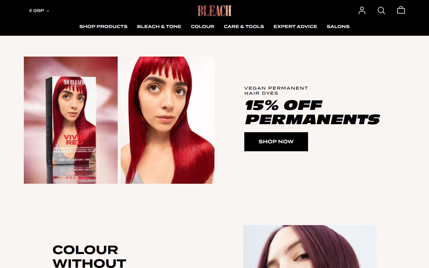
Bleach London’s colourists are among the most skilled in London. They pioneered techniques for achieving bold colours on diverse hair types and textures. This expertise is the brand’s deepest competitive advantage — it is what gives the products credibility and the salons their reputation. But the website does not share this expertise with visitors. There are no tutorials explaining how to apply colour at home. No guides to choosing the right shade. No video content showing the process from application to result. No stylist profiles that convey the depth of knowledge behind the brand. For a company that made bold hair colour accessible, the website is surprisingly inaccessible to someone who has never coloured their hair before. The expertise exists in the salons. It does not transfer to the screen.
Intentional minimalism limiting brand depth
The black-and-neon aesthetic is deliberately stark. It reflects the brand’s east London origins and its refusal to look like a mainstream beauty brand. There is intention behind the minimalism — it is a design choice, not a design limitation. But the minimalism extends to the content as well as the visuals. The founding story is not told in depth. The brand philosophy is implied rather than stated. The visual archives of the brand’s work — the transformations, the editorial shoots, the creative colouring that built Bleach London’s reputation — are not prominently featured. A minimal visual approach can coexist with rich content. The website currently treats minimalism as a content strategy when it is actually a visual one.
What Works
The salon network provides an irreplaceable credibility layer. Any brand can sell hair colour in a bottle. Bleach London sells hair colour in a bottle that was formulated by the same colourists who work in its salons. This connection between professional expertise and consumer product is the brand’s strongest competitive advantage. Shrine and Crazy Color and Arctic Fox are product brands. Bleach London is a salon brand that also makes products. The difference is meaningful.
The Dalston, Brixton, and Seven Dials locations are culturally specific choices that reinforce the brand’s identity. These are not random high-street locations. They are neighbourhoods associated with creativity, diversity, and self-expression — the values that hair colour at its best represents. The salon addresses are brand statements.
The founding story — kitchen sink, friends, east London — is authentic and aligned with the brand’s current identity. Bleach London did not launch with venture capital and a marketing strategy. It started with people mixing colours at home and sharing the results. This origin is the bridge between the salon and the product business: the idea that great colour does not require a salon, but a salon can take it further.
The Wider Pattern
Across the brands we have reviewed, the challenge of serving two distinct audiences through a single website appears repeatedly. Yard Sale Pizza splits between delivery customers and dine-in visitors. Home House serves prospective members and existing members through the same pages. Bleach London divides between salon customers and product shoppers. The structural tension is the same in each case: a brand with multiple use cases creates a digital experience that forces the visitor to choose rather than guiding them. The solution is never to build two separate websites — the brand benefits from the connection between its businesses. The solution is navigation architecture that acknowledges different visitor intentions and creates clear paths through the site for each one, while making the bridges between them visible and inviting.
If We Were Starting Fresh
We would build the digital experience around the idea of colour expertise — a single concept that connects the salon, the products, and the brand’s history.
The homepage would not force a choice between salon and shop. It would present Bleach London as what it is: the place that made bold hair colour possible for everyone. The salon represents the highest expression of that expertise. The products bring it home. The education content — tutorials, colour guides, stylist tips — bridges the two.
The founding story would sit at the heart of the brand narrative. The kitchen sink, the first colours mixed at home, the friends who became the first customers. This is not just history — it is the philosophical foundation of the product line. Bleach London was born from the idea that you should not need a salon to have extraordinary colour. The products exist because of that belief. The salons exist because some colour deserves a professional’s hand. Together, they offer a spectrum from DIY to expert, and the website would present that spectrum as a single, navigable journey.
The education layer would be substantial. How to choose your colour. How to apply it. What to expect. How to maintain it. When to visit a salon instead. This content would serve the brand’s purpose — making colour accessible — while also functioning as the connective tissue between the product pages and the salon booking pages. The expertise flows in both directions.
Wondering if YOUR brand has the same gaps?
We will tell you -- for free. Our team will analyse your website and brand, then send you an honest review.
Get Your Brand ReviewFeature Your Review
Display this badge on your website to showcase your independent brand review.

