Candy Kittens
Industry: Hospitality
Verdict: “A confectionery brand that redefined sweets — and a website that sells them like any other.”
Reviewed: April 2026
Who They Are
Candy Kittens was founded by Jamie Laing and Ed Williams with a proposition that sounded simple: make sweets that adults are not embarrassed to eat. Premium ingredients, natural flavours and colours, vegan-friendly, and packaging that looks like it belongs on a fashion shelf rather than a petrol station counter. Laing’s background — Chelsea, Made in Chelsea, a public profile built on personality rather than confectionery — gave the brand an origin story that traditional sweet manufacturers could not replicate. The range spans permanent flavours (Wild Strawberry, Peach Fizz, Sour Watermelon) and seasonal limited editions, sold through major UK retailers including Sainsbury’s, Tesco, and WHSmith, and directly through a Shopify store. The brand describes itself as “new fashioned sweets” — a positioning that implies both a break from tradition and a claim to quality.
What We Noticed
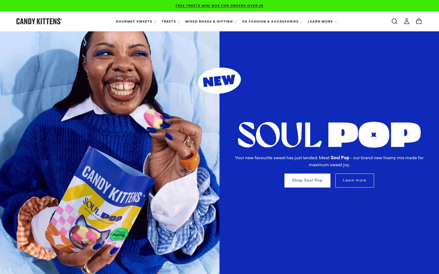
Visual energy without editorial substance
The Candy Kittens website is visually alive. Bold colours, playful typography, product photography that pops against bright backgrounds. The design captures the brand’s personality — young, energetic, unapologetically fun. This is a confectionery brand that looks different from its competitors, and the website reflects that difference visually. But the energy is surface-level. Beneath the bold graphics and animated flourishes, there is very little content. No editorial pieces about the “new fashioned” philosophy. No deep dive into the ingredient choices that differentiate natural, vegan sweets from conventional confectionery. No exploration of the taste development process. The visual identity says “we are different.” The editorial content does not explain how or why. For a brand competing on the promise of a better sweet, the website invests in looking different rather than explaining what makes the product genuinely different.
A founder story present but underweight
Jamie Laing’s journey from reality television to confectionery entrepreneur is an unusual founding narrative. It is specific, it is humanising, and it provides the brand with a personality that no amount of design work can fabricate. The website acknowledges the founder — Laing’s name and presence are not hidden. But the story of why he started a sweet company, what he wanted to change about the confectionery industry, and how he went from a Chelsea flat to Sainsbury’s shelves is not told with the depth it deserves. Founding stories matter in DTC because they answer the question that every new brand must address: why does this exist? Candy Kittens has a genuine answer to that question. The website gestures toward it without delivering it.
“New fashioned” as label rather than position
The phrase “new fashioned sweets” is Candy Kittens’ central brand claim. It is a good line — it implies that traditional sweets are outdated, that this brand represents an upgrade, and that there is a generational shift happening in confectionery. But the website treats it as a tagline rather than a thesis. What does “new fashioned” actually mean in practice? It means vegan, natural colours, natural flavours, premium ingredients, and packaging that does not look like it was designed for children. Each of these is a substantive choice with a story behind it. Why vegan? What is wrong with artificial colours? What does “natural flavours” actually taste like? These are the questions that turn a tagline into a brand position, and the website does not address them.
What Works
The retail distribution is a genuine achievement. Getting a premium confectionery brand onto Sainsbury’s and Tesco shelves — alongside Haribo, Maynards, and the established players — validates the proposition at a commercial level that DTC sales alone cannot reach. It proves that “new fashioned sweets” is not a niche idea but a mainstream one. The brand has earned its place on the shelf, which means millions of consumers encounter it in contexts where they make impulse decisions.
The packaging design is one of the strongest visual identities in UK confectionery. The bold colours, the kitten motif, the contemporary typography — the bags are instantly recognisable on a crowded retail shelf. In a category where most packaging is designed for children or designed by committee, Candy Kittens’ bags look like they were designed by people who care about design. This matters commercially: in an impulse category, packaging is the first and often only marketing touchpoint.
The vegan and natural positioning is ahead of the market. As consumer interest in plant-based and clean-label products continues to grow, Candy Kittens is already there — not as a recent pivot but as a founding principle. The brand does not need to reformulate or reposition. It was built this way from the start.
The Wider Pattern
Across the brands we have reviewed, the visual identity gap — where a brand’s design quality outpaces its editorial depth — appears frequently in DTC brands built on strong aesthetics. Grind has a Creative Director on staff and consistent product photography but lacks the editorial layer to match. Stanwell House has renovated its physical space but not its digital presentation. Candy Kittens has one of the most energetic visual identities in UK confectionery and a website that deploys that energy without substance behind it. The pattern suggests that visual design and editorial content are often treated as separate investments, when they should be inseparable. A beautiful page with nothing to say is a missed opportunity. A page with substance but poor design never gets read. The brands that win are the ones that match editorial depth to visual quality.
If We Were Starting Fresh
We would build the digital experience around the “new fashioned” manifesto — not as a tagline at the top of the page but as a philosophy that runs through every piece of content.
The homepage would answer the question that the brand’s existence raises: what was wrong with old-fashioned sweets? Artificial colours, artificial flavours, gelatine, ingredients that most adults would rather not think about. Candy Kittens exists because someone decided that sweets could be made better, and the website would make that case with specificity and conviction.
Jamie Laing’s story would sit prominently — not as celebrity endorsement but as founder narrative. The journey from “I want better sweets” to “I sell them in Sainsbury’s” is inherently compelling. The product pages would explain the ingredients with the same care that the packaging presents them: why these flavours, why these ingredients, why it matters that the kitten on the bag represents something more than a logo. New fashioned is a good position. The website needs to argue it, not just state it.
Wondering if YOUR brand has the same gaps?
We will tell you -- for free. Our team will analyse your website and brand, then send you an honest review.
Get Your Brand ReviewFeature Your Review
Display this badge on your website to showcase your independent brand review.

