Flow LDN
Industry: Wellness
Verdict: “Studio photography that captures the feeling — and a booking flow that loses it.”
Reviewed: April 2026
Who They Are
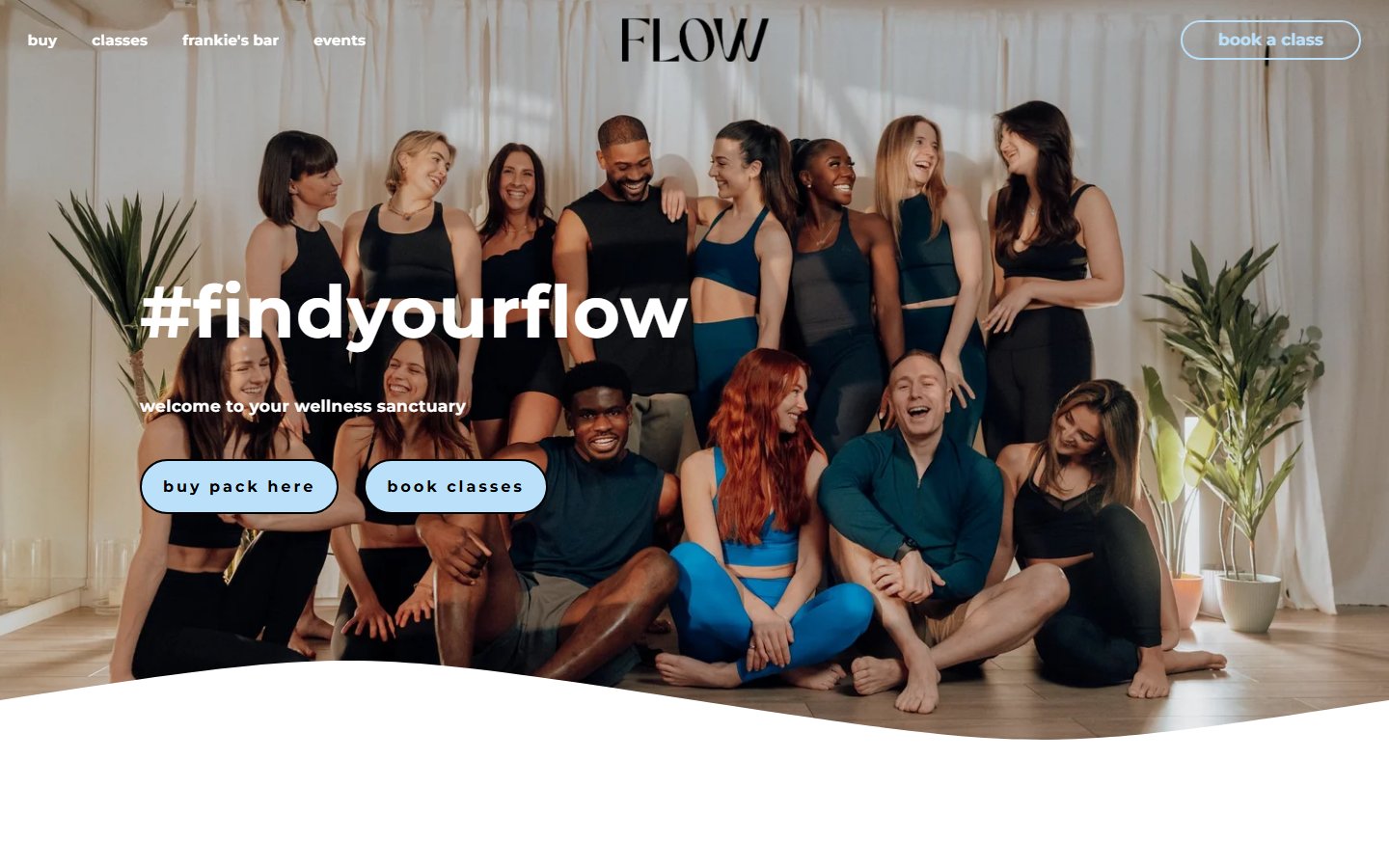
Flow LDN is a boutique wellness studio in Fitzrovia, central London, a short walk from Goodge Street station. The studio offers reformer Pilates, yoga, mat Pilates, barre, and strength classes in an intimate setting designed around the principle of mindful movement. The space is built for calm: wooden floors, warm ambient lighting, large mirrors, and modern Allegro 2 reformers arranged in clean rows. The brand positions itself as a sanctuary from the pace of central London, targeting professionals who want to build strength and resilience without the intensity of a Barry’s or F45 session. The visual identity is minimalist and precise — neutral tones, elegant typography, abundant white space. Flow LDN competes with Heartcore, Frame, and FLY LDN in a London boutique wellness market that has grown significantly since the pandemic, driven by demand for low-impact, high-quality movement.
What We Noticed
The redirect as reception
Every visitor to flowldn.com is immediately redirected to a /lander page. This is a marketing funnel, not a homepage. The lander prioritises a single action — book a class or claim an introductory offer — and strips away the navigation, class descriptions, instructor profiles, and studio philosophy that a first-time visitor would normally use to decide whether this is the right studio for them. It is the digital equivalent of walking into a beautiful studio and being handed a clipboard before you have had a chance to look around. For returning members who already know what they want, the funnel works. For a new visitor discovering the brand through search, social, or word of mouth, it removes the context that builds conviction.
The atmospheric gap
Flow LDN’s studio photography is genuinely beautiful. Soft natural light. Neutral activewear on focused practitioners. Warm wooden floors. The imagery captures a feeling — of precision, calm, and quality — that is exactly what the physical studio delivers. Then the visitor clicks “Book” and encounters a third-party timetable widget. The colour palette shifts. The typography changes. The careful minimalism of the brand experience is replaced by a functional scheduling interface that could belong to any gym in any city. The transition from atmosphere to transaction is abrupt. The feeling that the photography built is not sustained through the moment that matters most — the moment the visitor decides to commit.
The small-screen compression
Flow LDN’s design was conceived for a desktop experience. The atmospheric photography needs width to breathe. The elegant typography needs space to land. The minimalist layout relies on generous margins and white space to create its sense of calm. On a mobile screen, all of this compresses. The hero image crops. The white space shrinks. The booking widget, already functional rather than atmospheric, becomes a scrolling list of time slots and class names that requires significant tapping and swiping to navigate. In a market where the majority of boutique fitness bookings happen on phones — often during a commute, a lunch break, or a moment between meetings — the mobile experience is where most customers will form their impression of the brand.
The hidden philosophy
Flow LDN has a clear point of view: mindful movement over intensity, strength without burnout, quality over volume. But this philosophy is not surfaced on the lander. A visitor encounters the visual aesthetic — which communicates calm and precision — but does not read why Flow LDN believes in this approach, how the class methodology was developed, or what makes the instructors distinctive. Heartcore publishes instructor profiles with training backgrounds and teaching philosophies. FLY LDN communicates its community ethos through visible content. Flow LDN lets the photography do the talking, which works until the visitor needs a reason beyond the visuals to choose this studio over the one around the corner.
What Works
The studio photography is the strongest single asset in Flow LDN’s brand. In a category where most boutique studios use the same visual language — moody lighting, dramatic angles, sweaty close-ups — Flow LDN’s imagery is distinctive. The soft, natural light and neutral palette create a visual identity that is immediately recognisable and consistently applied. This is not stock photography or generic fitness imagery. It is atmospheric brand photography that communicates a specific feeling.
The Fitzrovia location is commercially strong. Tottenham Street sits between Goodge Street and Warren Street stations, within walking distance of some of London’s densest office neighbourhoods. The catchment area is professionals with disposable income and a lunchtime or pre-work window for movement.
The class range — reformer Pilates, yoga, barre, mat Pilates, strength — covers the full spectrum of mindful movement without diluting into high-intensity territory. This is a deliberate editorial choice. Flow LDN knows what it is and what it is not. That clarity of positioning is uncommon in a market where most studios try to be everything.
The studio itself — the wooden floors, the Allegro 2 reformers, the warm lighting — is a physical brand asset. The interior design does the same work as the photography: it communicates quality, calm, and intentionality without saying a word.
The Wider Pattern
The tension between brand atmosphere and booking mechanics appears across every boutique wellness brand we have reviewed. The physical studio experience is sensory, emotional, and carefully designed. The digital booking flow is functional, standardised, and often outsourced to a third-party platform that was built for efficiency rather than brand coherence. Heartcore manages this better than most — its booking flow maintains the brand’s visual language throughout the transaction. Frame leans into energy and personality to carry the visitor through the functional steps. The White Company, in a different category entirely, demonstrates how a brand built on sensory experience can maintain that feeling through every digital interaction, from browsing to checkout. The studios that win long-term loyalty are the ones that make the entire journey — discovery, decision, booking, arrival — feel like a single, continuous experience.
If We Were Starting Fresh
We would keep the photography. It is doing exactly what brand photography should do — communicating a feeling before a single word is read. But we would build a digital experience around it that matches the quality of what the camera captures.
The lander redirect would go. In its place, a homepage that lets a first-time visitor discover the studio the way they would discover a physical space: by looking around, understanding the philosophy, meeting the instructors, and choosing to stay. The booking flow would still be prominent. But it would come after context, not instead of it.
The booking experience itself would be redesigned to maintain the brand’s visual language from first impression through confirmed reservation. The colour palette, typography, and sense of space that define the brand would carry through the timetable, the class selection, and the payment screen. The transition from “I want to try this” to “I have booked” would feel like one continuous experience, not a handoff from a design studio to a software platform.
The mobile experience would be rebuilt from the ground up. Not adapted from desktop, but designed for the device where most bookings happen. The atmospheric photography would be cropped and composed for vertical screens. The booking flow would be streamlined for thumb navigation. The white space that creates calm on desktop would be translated into clear hierarchy and breathing room on mobile.
And the philosophy — the “why” behind mindful movement, the instructor expertise, the methodology — would be visible from the first visit. The photography captures how Flow LDN feels. The words need to explain why it matters.
Wondering if YOUR brand has the same gaps?
We will tell you -- for free. Our team will analyse your website and brand, then send you an honest review.
Get Your Brand ReviewFeature Your Review
Display this badge on your website to showcase your independent brand review.

