Home House
Industry: Hospitality
Verdict: “Eighteenth-century splendour in three Marylebone townhouses — and a website too slow to show it.”
Reviewed: April 2026
Who They Are
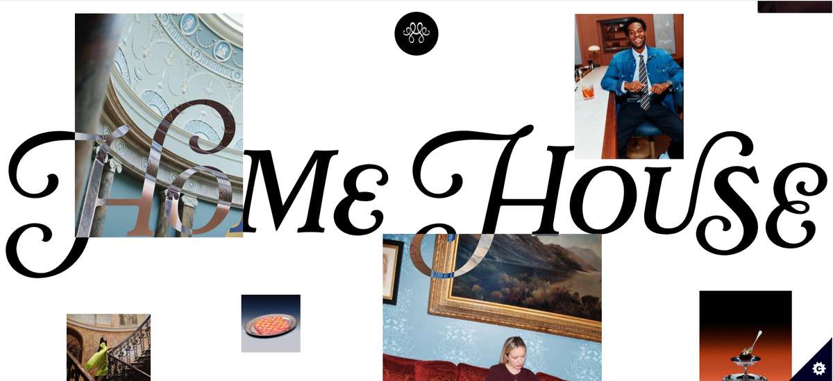
Home House is a private members’ club in three interconnected Georgian townhouses on Portman Square, Marylebone. The buildings are Grade I listed, designed in part by Robert Adam, with original plasterwork, cantilevered staircases, and proportions that belong to a museum rather than a members’ club. The interiors layer contemporary art and modern furniture over 18th-century architecture — a deliberate tension between period splendour and present-day taste. Membership includes restaurants, bars, a drawing room, private event spaces, bedrooms for overnight stays, a gym, and a spa. The club is multi-award-winning and positions itself as something more intimate than the global members’ club chains: three houses, not forty. A Marylebone address, not a worldwide network. The scale of a home, not a hotel.
What We Noticed
Splendour that arrives slowly
Home House’s website features striking photography — the kind of images that stop you scrolling. An 18th-century drawing room lit by chandeliers. A spiral staircase viewed from below. Contemporary art hanging above a marble fireplace. The visual material is exceptional. But on mobile devices, where the majority of initial discovery now occurs, the experience is undermined by load times. Images arrive in stages. Sections render progressively. The impact of walking into an extraordinary room — which should be instantaneous, visceral, a sharp intake of breath — becomes a gradual reveal that loses its power. For a club that trades on the quality of first impressions, the mobile experience creates a first impression of waiting. The architecture deserves to arrive all at once. Currently, it trickles in.
Photography doing the work of editorial
The images across the site are doing virtually all of the heavy lifting. They convey mood, quality, and aspiration effectively — a potential member can look at Home House’s photography and immediately understand the aesthetic proposition. But photography alone cannot convey what it is like to be a member. What happens in these rooms? Who uses them? What does a Tuesday evening in the drawing room feel like? What kind of events fill the calendar? The editorial layer that should sit alongside the photography — stories, voices, cultural programming — is thin. The result is a website that functions as a lookbook: beautiful to browse, but static. You can see Home House. You cannot yet feel it.
Membership as information rather than invitation
The membership section provides the practical details — what is included, how to apply, the broad strokes of what membership entails. This is necessary information. But it reads as administrative rather than aspirational. The question a potential member is really asking is not “what do I get?” but “what will my life look like if I join?” The distinction matters. Home House is competing with Soho House (global access, creative community), The Ned (grand drama, rooftop views), and Annabel’s (Mayfair glamour, social currency). Each of those clubs tells a story about the kind of person who belongs there. Home House has a distinctive story to tell — intimate scale, architectural authenticity, a genuine home rather than a commercial venue — but the membership section does not yet tell it.
What Works
The architectural setting is an extraordinary competitive advantage. Grade I listed townhouses with Robert Adam interiors are not reproducible. No new members’ club can build 18th-century plasterwork or source a cantilevered Georgian staircase. Home House has inherited something that money cannot buy and time cannot replicate. This architectural authenticity separates it from every club that has opened in the last 20 years, regardless of their budget.
The Marylebone location sets Home House apart from the Mayfair and Soho cluster. Portman Square has a residential quietness that reinforces the “home” proposition. The name is literal — this is a house that functions as a home for its members. The location supports the brand promise in a way that a Mayfair address would not.
The intimate scale — three townhouses rather than a global network — is a positioning strength that the brand clearly understands. In a market where Soho House has 40 locations and growing, the decision to remain singular and small is a deliberate brand choice. It means every member knows they are joining something finite, personal, and unreplicable. The exclusivity is architectural, not artificial.
The Wider Pattern
Across the members’ clubs and hospitality brands we have reviewed, the mobile experience is where the physical-digital gap hits hardest. Soho House has atmospheric photography that conveys mood but not culture. Home House has striking photography that conveys architecture but arrives too slowly to land. The pattern is consistent: brands with extraordinary physical spaces invest in high-quality photography, place it on their websites, and then discover that the technical delivery undermines the visual impact. Large images on slow connections. Parallax effects that stutter on older devices. The irony is that the brands most committed to visual quality are the ones most likely to create performance problems. The solution is not lower quality but smarter delivery — prioritising speed without sacrificing impact.
If We Were Starting Fresh
We would start with performance. Before adding a single piece of content, the site would be optimised to ensure that Home House’s extraordinary photography loads instantly on every device. The first impression must be as immediate online as it is in person — the visual impact of walking through the front door of a Robert Adam townhouse, delivered in milliseconds.
Then we would build the editorial layer. Member stories, cultural programming, the rhythm of life inside the club — the things that photography cannot convey. What does a morning in the drawing room feel like? What happens when the club hosts a private dinner for twenty in the ballroom? These are the experiences that convert a curious visitor into an applicant. The membership section would become an invitation rather than an information page: not “here is what you get” but “here is what your Tuesdays could look like.”
Three townhouses on Portman Square, designed by Robert Adam, filled with contemporary art, and home to a membership that values intimacy over scale. The story writes itself. The website needs to let it arrive.
Wondering if YOUR brand has the same gaps?
We will tell you -- for free. Our team will analyse your website and brand, then send you an honest review.
Get Your Brand ReviewFeature Your Review
Display this badge on your website to showcase your independent brand review.

