Hub Box
Industry: Hospitality
Verdict: “A provenance story buried under a booking widget.”
Reviewed: April 2026
Who They Are
Hub Box is a Southwest burger and craft food restaurant group founded in 2003 in St Ives harbour, Cornwall. Over two decades, the brand has grown to 12 locations across Cornwall, Devon and South Wales, with restaurants in Truro, Falmouth, Exeter, Cardiff and Cheltenham among others. The food proposition centres on 21-day dry-aged Cornish rare breed beef from Philip Warren butchers, one of the most respected independent butchers in the country. Every restaurant is fitted with reclaimed materials, meaning no two locations look the same. The brand carries a surf, skate and coastal culture aesthetic and has built a loyal Southwest following around signature items like the Big Kahuna Burger. Hub Box recently underwent a full rebrand by Meor Studio, introducing an electric yellow and jet black visual identity.
What We Noticed
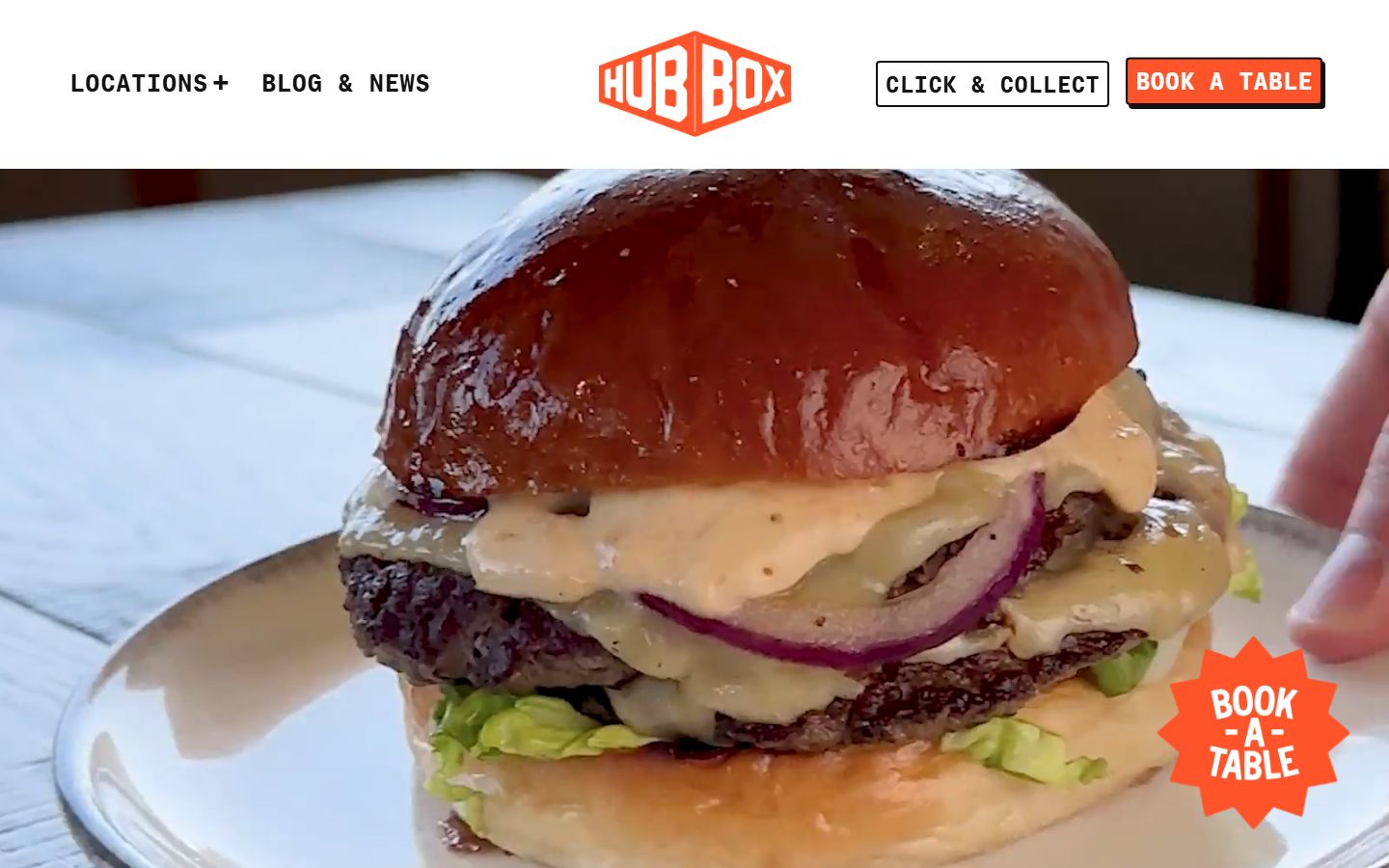
The food is not the first thing you see
Hub Box serves some of the most carefully sourced burgers in the UK. Philip Warren beef, 21-day dry ageing, Cornish rare breed cattle. This is not a standard fast-casual supply chain. Yet on the homepage, the first thing a visitor encounters is a booking widget. The food, the provenance, the reason someone would choose Hub Box over any other burger restaurant, sits below the fold. This is a design choice that prioritises operations over appetite. Every restaurant brand needs a booking function. But when the booking interface takes the hero position, it communicates that the brand’s primary concern is logistics, not flavour.
A rebrand that looks forward but forgot to bring the story
The Meor Studio rebrand is confident. Electric yellow and jet black is a bold palette. The location-specific video banners are a smart touch. The overall aesthetic feels modern, vibrant and slightly rebellious. But the rebrand has inadvertently stripped out the heritage that makes Hub Box distinctive. Twenty years of history, starting from a single unit in St Ives harbour, does not feature prominently anywhere on the site. The Philip Warren partnership, the reclaimed-material interiors, the coastal culture roots; these details are either absent from the main pages or mentioned in passing. The result is a website that looks like a trendy burger chain rather than a Southwest institution with two decades of provenance behind it.
Provenance without proof
The Philip Warren beef story is Hub Box’s single strongest differentiator against national competitors like Honest Burgers, Fat Hippo and MeatLiquor. None of them can claim a 20-year relationship with a Cornish rare breed butcher. But the website does not substantiate the claim in any meaningful way. There is no farm-to-plate narrative, no photography of the supply chain, no explanation of what 21-day dry ageing means or why rare breed matters. Provenance claims without visible evidence are just marketing copy. With the right content, Hub Box could make this story tangible and defensible.
Twelve locations, one experience
Each Hub Box restaurant uses reclaimed materials and has its own character. This is a genuine point of differentiation. Most multi-site restaurant brands standardise their interiors for consistency. Hub Box does the opposite, and it works. But online, this distinctiveness collapses into a uniform listing page. Individual location pages do not showcase what makes each restaurant different. The surf culture of the St Ives original, the city-centre energy of the Cardiff site, the coastal vibe of Falmouth; none of it comes through. Each location is a story. The website treats them as addresses.
What Works
The Meor Studio visual identity is genuinely impressive. Electric yellow on jet black is immediate, ownable and difficult to confuse with any competitor. The location-specific video banners show an understanding that each restaurant has its own personality, even if the rest of the site does not follow through on that promise. The food itself, 21-day dry-aged Cornish rare breed beef, represents a level of sourcing commitment that most competitors at this price point cannot match. The Big Kahuna Burger has become a Southwest icon, the kind of signature item that drives word-of-mouth and repeat visits. And the brand’s cultural positioning around surf, skate and coastal living gives it a personality that feels earned rather than manufactured. Hub Box did not adopt coastal culture as a marketing angle. It was born in a harbour.
The Wider Pattern
Across the hospitality brands we have reviewed, casual dining chains share a recurring tension: the operational demands of running multiple locations pull the website toward function, while the brand demands pull it toward storytelling. Most brands default to function. The booking widget wins. The menu grid wins. The location finder wins. And the personality that fills the restaurants never makes it online.
This is not unique to Hub Box. We see it in Tortilla Mexican Grill, a 62-location AIM-listed chain whose in-store energy, bold colours, food built in front of you, a loyalty programme called the Burrito Society, stops at the restaurant door. The website is a transaction layer. The same tension appears in different forms across House of Gods, Sketch London and others we have reviewed: brands that invest heavily in the physical experience and then treat the digital one as a utility.
The common lesson is straightforward. A growing share of customers encounter a restaurant brand online first, whether through search, social media or delivery platforms. If the website communicates logistics rather than personality, the brand is leaving its most distinctive qualities out of the first impression.
If We Were Starting Fresh
Hub Box has something most casual dining brands would pay dearly for: a genuine story. Twenty years in the Southwest, a named supplier with a reputation, interiors that are individually crafted, a cultural identity rooted in a real place. The direction is not to invent something new but to make visible what already exists.
If we were approaching this with fresh eyes, the website would lead with the food. Not the booking widget, not the video banner, but the burger. The Philip Warren story would run through the experience as a visible thread, not a footnote. Each location page would show the reclaimed materials, the local character, the specific personality of that restaurant. The heritage, St Ives 2003, two decades of Southwest dining, would sit alongside the new Meor Studio identity rather than being replaced by it. The rebrand gave Hub Box a striking new visual language. The next step is to fill that language with the substance that has always been there.
Wondering if YOUR brand has the same gaps?
We will tell you -- for free. Our team will analyse your website and brand, then send you an honest review.
Get Your Brand ReviewFeature Your Review
Display this badge on your website to showcase your independent brand review.

