Gail’s Bakery
Industry: Food & Drink
Verdict: “A neighbourhood bakery that grew to 130 locations and forgot to mention it.”
Reviewed: April 2026
Who They Are
Gail’s was founded in 2005 by a team of bakers who believed craft baking was vital to community life. Starting in London, the brand has since grown to over 130 locations across the UK, each bakery designed to reflect the character of its local neighbourhood — from the fixtures to the menu specials. Gail’s bakes fresh daily using long fermentation techniques, sources ingredients carefully, and trains bakers in-house. The loyalty programme drives repeat visits. Despite this growth, the brand has resisted the templated rollout approach of most chain bakeries, maintaining its neighbourhood identity at a scale that most independents never reach.
What We Noticed
The number that never appears
Gail’s operates over 130 bakeries across the UK. That is a remarkable achievement for a brand built on craft baking and neighbourhood identity. It is the kind of number that communicates credibility, momentum, and proof that quality and scale are not mutually exclusive. But open gailsbread.co.uk and you will not find it. The homepage leads with seasonal menu highlights, bakery photography, and online ordering. All of which are well-executed. None of which communicate the brand’s most powerful proof point. A visitor encountering Gail’s for the first time has no way of knowing whether this is a three-location London bakery or a national institution. The number does the work of a hundred marketing claims, and it is nowhere to be seen.
Craft assumed, never stated
Long fermentation. Careful sourcing. In-house baker training. These are the practices that separate Gail’s from the industrial bakery chains that dominate the UK high street. They are also completely absent from the homepage. The baking philosophy — the reason the bread tastes different — is treated as something the customer already knows. But most visitors landing from a search engine, a recommendation, or a Sainsbury’s encounter do not know. They see beautiful photography of bread and pastries, which is pleasant but undifferentiated. The process behind the product is the brand’s credibility, and it sits behind several clicks rather than meeting the visitor at the front door.
A founding story that deserves more than a footnote
“A team of bakers who believed craft baking was vital to community life” — this is the kind of founding statement that brands spend years trying to articulate. Gail’s has the real thing: a genuine purpose, tested over nearly two decades and 130 bakeries. It is specific, it is earned, and it is buried deep in the site structure. The journey from a single London bakery to a national presence with neighbourhood-level identity is inherently interesting. It gives the premium pricing context and the loyalty programme meaning. But the site treats its origin as history rather than as the reason to choose Gail’s over the bakery next door.
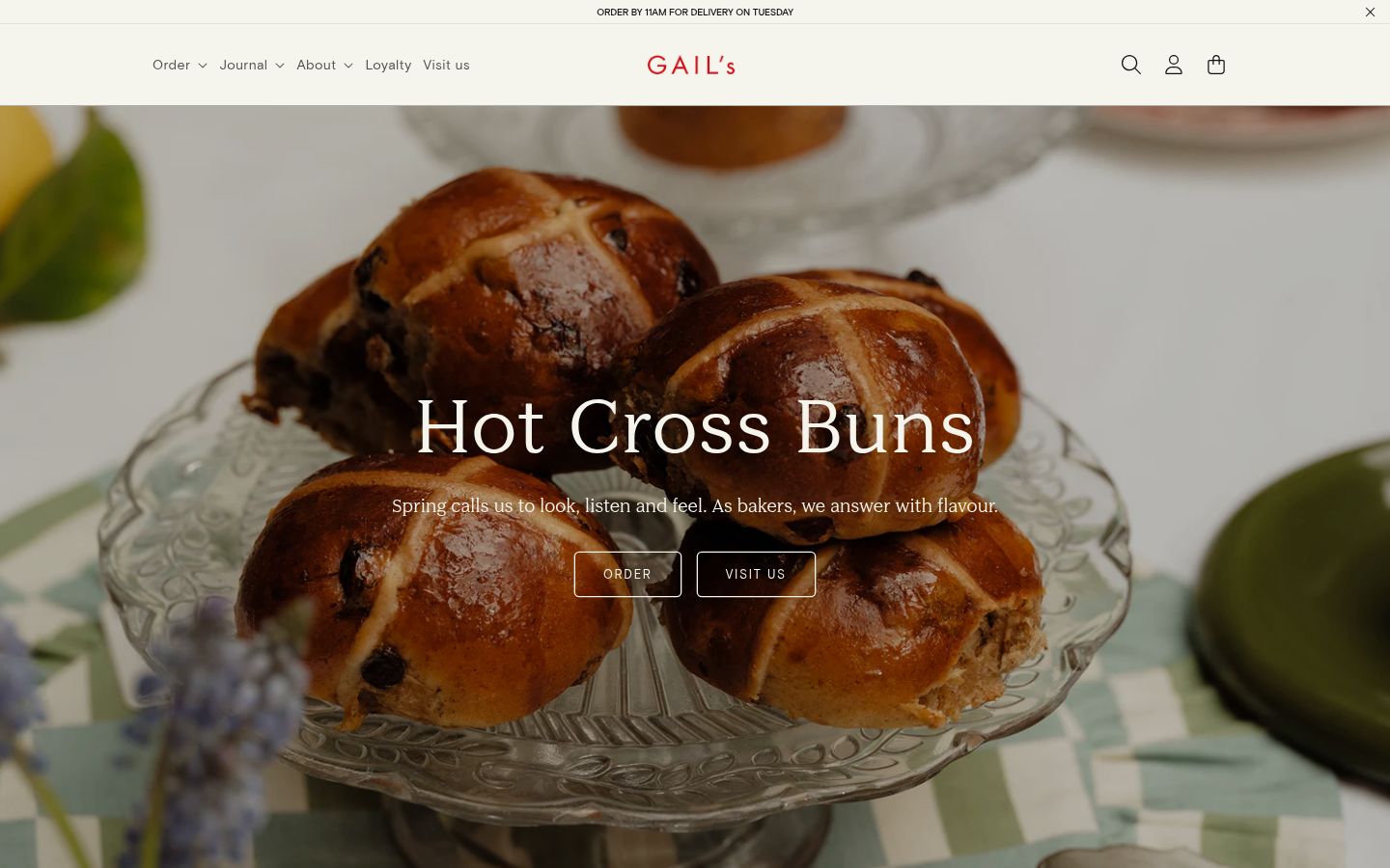
Design warmth without editorial depth
The website is genuinely well-designed. The cream-and-red palette feels warm and inviting. The food photography is consistent and appetising. The hand-drawn illustration touches reinforce the artisan positioning. But for a brand at this level of visual sophistication, the editorial layer is thin. There are no long-form pieces about sourcing, no deep dives into fermentation, no baker profiles, no neighbourhood stories. Competitors like Ole & Steen lead with founder-led narratives and baking philosophy. Paul leverages 130 years of French tradition as a headline. Gail’s has an equally compelling story but lets the photography do all the talking.
What Works
The neighbourhood-first philosophy is the genuine article. Each Gail’s bakery is designed to reflect its local area — not just in decor but in menu specials and team composition. This is an operational achievement that chain bakeries cannot replicate at scale and is a real differentiator that matters to the customers who visit daily.
The visual identity is a tangible asset. The cream-and-red palette, the hand-drawn illustration touches, the consistent food photography at warm, natural tones — the brand feels artisan without overclaiming. It is the kind of visual language that builds trust on first impression.
The loyalty programme (nine stamps for a free drink) is simple, understood, and drives habitual behaviour. It does not try to be a complicated membership scheme. It does exactly what it needs to do: give regulars a reason to keep coming back to their local Gail’s rather than the coffee shop next door.
The Wider Pattern
Across the food and drink brands we have reviewed, we keep seeing the same structural gap: brands that have done genuinely difficult things — building a real mission, achieving scale without losing identity, creating products that justify premium pricing — and then failing to communicate any of it on their website. Grind, the DTC coffee brand we reviewed, has a compostable innovation that solves the biggest environmental objection to coffee pods, a genuine ocean plastic recovery foundation, and a Shoreditch origin story. Its homepage leads with a discount code. Gail’s has achieved craft baking at a scale that most would consider impossible. Its homepage leads with a seasonal menu. The pattern is consistent: earned credibility gets less screen time than promotional mechanics.
If We Were Starting Fresh
We would build the homepage around three things that gailsbread.co.uk currently omits: the number, the process, and the purpose.
The number — 130+ bakeries, every loaf baked fresh daily — would sit at the top of the page as a headline stat. Not buried in an “About” section. Not implied. Stated. It is the single most powerful proof point the brand has, and it should be the first thing a new visitor sees.
The process — long fermentation, careful sourcing, in-house baker training — would become visible content rather than assumed knowledge. A “How We Bake” section that shows the work behind the bread. Not a manufacturing tour, but the kind of transparency that justifies the premium and builds trust with first-time visitors who do not yet understand why Gail’s costs more than Greggs.
The purpose — “a team of bakers who believed craft baking was vital to community life” — would become the brand’s visible foundation. The founding story would sit at the heart of the navigation, not three clicks deep. Each bakery location page would become a neighbourhood portrait: its own character, its own specials, its own team.
Gail’s has already done the hard part. The baking is genuinely good. The neighbourhoods feel genuinely local. The growth has been genuinely earned. The website just needs to say so.
Wondering if YOUR brand has the same gaps?
We will tell you -- for free. Our team will analyse your website and brand, then send you an honest review.
Get Your Brand ReviewFeature Your Review
Display this badge on your website to showcase your independent brand review.

