Batch Distillery
Industry: Food & Drink
Verdict: “From a Burnley basement to the shelves of Fortnum & Mason — a decade of craft that the website has not caught up with.”
Reviewed: April 2026
Who They Are
Batch Distillery has been crafting spirits for ten years, starting in a basement in Burnley and now operating from a renovated mill in Lancashire. The range spans gins, rums, and whiskies, exported internationally and stocked in some of the UK’s most prestigious retailers: Selfridges, Harvey Nichols, Fortnum & Mason, and Booths. The brand runs a Gin Club subscription for direct-to-consumer discovery. The visual identity uses a distinctive deep magenta and burgundy palette that sets Batch apart from the blues, greens, and botanicals that dominate craft spirits branding.
What We Noticed
Three names that should be doing the selling
Selfridges. Harvey Nichols. Fortnum & Mason. Each of these retailers has a buying team that selects products based on quality, brand integrity, and alignment with their store’s positioning. Being stocked in one would be a significant credential. Being stocked in all three simultaneously places Batch Distillery in genuinely rarefied company — alongside brands with considerably larger budgets and longer histories. These are the names that tell a first-time visitor everything they need to know about where Batch sits in the market. On the website, the stockist logos could be more prominently positioned. They should not sit in a footer strip or an “as seen in” section that requires scrolling to reach. “Stocked in Selfridges, Harvey Nichols, and Fortnum & Mason” is the single most powerful sentence the brand can publish. It should greet visitors, not wait for them.
A ten-year story told as a timeline, not as a journey
Starting a distillery in a basement in Burnley and building it into a brand stocked in Fortnum & Mason within a decade is a narrative arc that screenwriters would envy. It has origin, struggle, craft, growth, and validation. But on the website, this story risks reading as a fact rather than a journey. The difference matters: “founded 2015 in Burnley” is a timeline entry. “We started making gin in a basement because we believed Lancashire could produce spirits as good as anything from London” is a story. The renovated mill, the first batch, the first retailer who said yes, the day the Fortnum & Mason order arrived — these are the moments that connect a visitor to the brand. A ten-year anniversary is the perfect occasion to tell them.
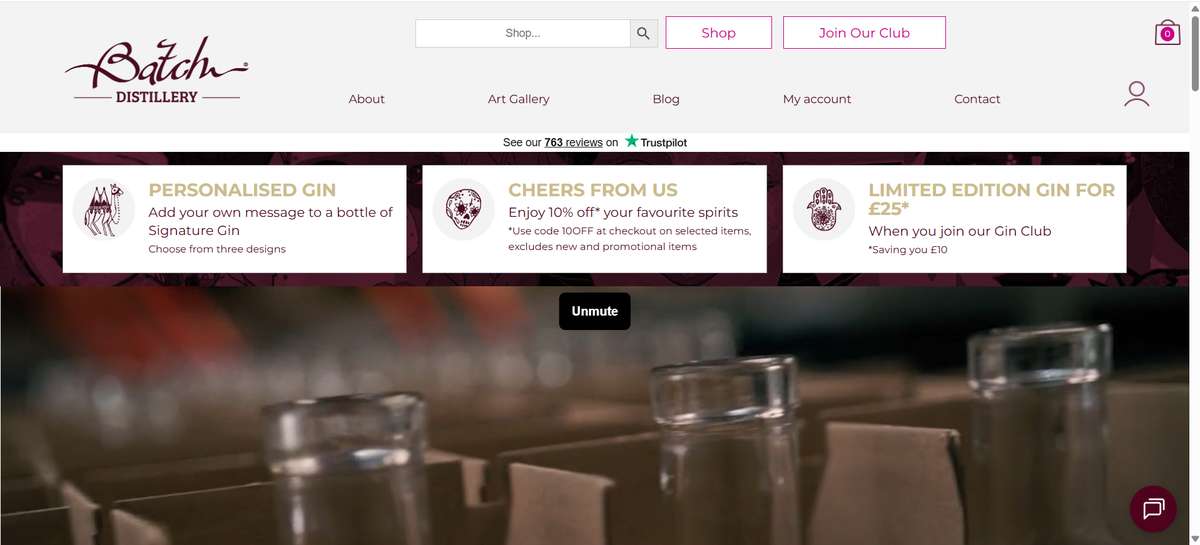
A magenta identity in a botanical world
The deep magenta (#CC0086) and burgundy (#4B0B20) palette is a bold choice in a category dominated by botanical greens, coastal blues, and craft browns. It is immediately distinctive — on a shelf, in a social feed, or in a browser tab, Batch looks like nothing else in the gin category. This is a visual asset worth leaning into. But the homepage’s visual hierarchy may dilute this distinctiveness through competing elements — an Instagram feed integration, multiple product sections, and navigation that has grown organically over a decade. The magenta works best when it has room. A cleaner homepage would let the colour do what it does naturally: stop someone mid-scroll.
What Works
The stockist roster is the brand’s most powerful credential. Selfridges, Harvey Nichols, Fortnum & Mason, and Booths together represent a cross-section of the UK’s most discerning retail environments. Each validates the product from a different angle: Selfridges for cultural relevance, Harvey Nichols for luxury positioning, Fortnum & Mason for heritage and quality, Booths for regional premium. This is not luck. It is the result of consistent product quality and deliberate brand positioning over ten years.
The basement-to-mill origin story is inherently compelling. In an era of polished brand launches backed by investment rounds and Instagram-first marketing, a distillery that started in a Burnley basement and built its way to Fortnum & Mason has the kind of authenticity that money cannot manufacture.
The product range breadth — gins, rums, and whiskies — demonstrates ambition and versatility. Many craft distilleries specialise in a single spirit. Batch has earned credibility across three categories, which suggests genuine distilling expertise rather than single-recipe success.
The Gin Club subscription creates a direct relationship with consumers, bypassing the retail margin and building a community around discovery. This is a channel that, if developed further, could become a significant revenue stream and loyalty driver.
The Wider Pattern
Exmoor Distillery, which we reviewed earlier, is stocked in Berry Bros & Rudd and National Trust shops — and presents this through a WordPress template. Surrey Copper Distillery has a 1757 gin recipe and Cowdray Park Polo Club sponsorship — and runs on a Divi page builder. Batch Distillery has a decade of craft validated by three of the UK’s most prestigious retailers — and the website has not fully leveraged those names. The pattern across spirits brands is consistent: the harder a distillery works to earn premium placement, the less prominently that placement appears in the digital experience. The retail buyers have already decided the brand belongs. The website needs to agree.
If We Were Starting Fresh
We would put the three names at the top of the page. Not as logos in a strip, but as a statement: “Stocked in Selfridges, Harvey Nichols, and Fortnum & Mason.” This is the credibility anchor. Everything else — the story, the range, the Gin Club — follows from the trust those names establish.
The ten-year anniversary would become a narrative feature. The basement in Burnley, the renovated mill, the milestones along the way. Not a corporate timeline but a founder’s story — specific, human, and honest about what it takes to build a spirits brand from nothing in the north of England.
The magenta identity would be given room to breathe. A cleaner homepage with fewer competing elements would let the colour do its work. The Instagram feed, if retained, would move to a dedicated social page rather than fragmenting the homepage’s visual focus.
The Gin Club would be positioned as membership, not subscription. The language would shift from transactional (frequency, price, cancel anytime) to experiential (discovery, access, community). A brand stocked in Fortnum & Mason can afford to position its direct channel as something worth joining, not just something worth trying.
Wondering if YOUR brand has the same gaps?
We will tell you -- for free. Our team will analyse your website and brand, then send you an honest review.
Get Your Brand ReviewFeature Your Review
Display this badge on your website to showcase your independent brand review.

