Firetree Chocolate
Industry: Food & Drink
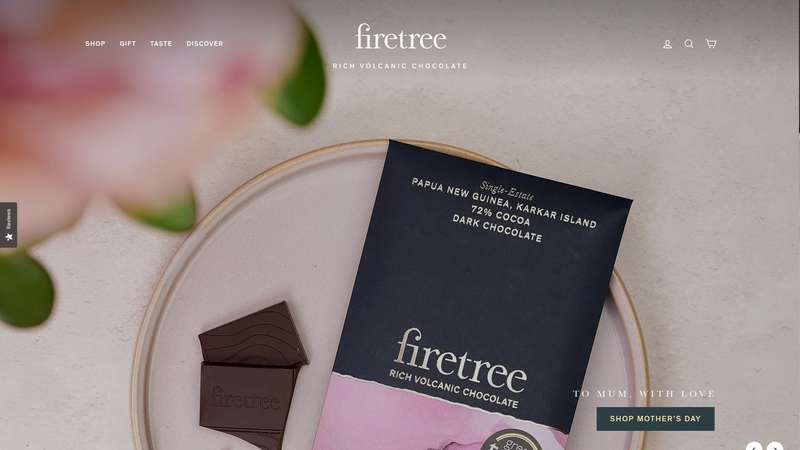
Verdict: “Chocolate from volcanic islands, described in text where it should be shown in colour.”
Reviewed: April 2026
Who They Are
Firetree Chocolate makes award-winning bean-to-bar chocolate from rare cocoa sourced on remote volcanic islands across the Pacific and Indian Oceans. The brand’s proposition is built entirely on terroir — the idea that volcanic soil, tropical climate, and island isolation produce cocoa with flavour profiles that cannot be found anywhere else. The Shopify store is structured around this idea, organising products by island of origin, taste note, and dietary need. The visual identity uses a dark, sophisticated aesthetic that positions Firetree firmly at the luxury end of UK craft chocolate.
What We Noticed
A story that reads when it should feel
“Remote volcanic islands across the Pacific and Indian Oceans.” This is one of the most evocative origin stories in the UK food industry. It conjures images of active volcanoes rising from tropical seas, cocoa trees growing in volcanic soil, and small communities harvesting rare beans on islands that most people could not find on a map. It is the kind of narrative that belongs in a documentary or a travel magazine. On the website, it is conveyed through well-written copy and static product photography. The text describes the islands. The images show the chocolate. But neither takes the visitor there. There is no interactive map. No video of the islands. No photography of the volcanic landscapes, the farms, or the people. The origin story is told, but it is not shown. For a brand whose entire premium justification is “our cocoa grows in places unlike anywhere else,” the digital experience should make those places vivid. Currently, it leaves them to the imagination.
Structure that serves the browser, not the explorer
The Shopify store is well-organised. Products are filterable by origin, taste profile, and dietary requirement. For a returning customer who knows what they want, the navigation is efficient. But for a first-time visitor — someone who has never heard of Firetree and does not yet know why volcanic island chocolate is different — the structure assumes knowledge rather than building it. The homepage presents products. It does not invite exploration. In luxury food, discovery is part of the experience. A visitor should feel that they are learning something as they browse — that each click reveals more of the story. The current site informs rather than draws in.
Terroir explained, not demonstrated
Firetree’s core concept is volcanic terroir — the idea that the minerals in volcanic soil, the altitude of the island, and the tropical microclimate produce cocoa with unique flavour characteristics. This is a sophisticated and genuinely interesting proposition. It borrows from the language of wine (where terroir is a well-understood concept) and applies it to chocolate (where it is still emerging). The website explains this connection, but the explanation lives in text blocks rather than in the product experience itself. A tasting note says “notes of red berries and citrus.” It does not say “these notes exist because the cocoa grew at 800 metres on volcanic basalt in the Solomon Islands.” The terroir story needs to travel all the way to the product page — not as a separate educational section, but as part of how each bar is presented.
What Works
The dark aesthetic is the right choice. In a craft chocolate market where many brands default to white backgrounds and clean minimalism, Firetree’s dark palette communicates luxury, depth, and seriousness. It reads as a brand that believes its product belongs in the company of fine wine and single-malt whisky rather than in the confectionery aisle. The visual identity does real positioning work.
The product organisation by origin is a strong structural decision. Browsing chocolate by island of origin reinforces the terroir concept at the navigation level. It tells the visitor that where the cocoa comes from matters — that a bar from Vanuatu is fundamentally different from a bar from the Solomon Islands. This is product architecture that teaches.
The award-winning status validates the quality claim. In luxury food, awards from recognised judges provide the external credibility that justifies the premium price. Firetree’s recognition says that the volcanic terroir concept produces chocolate that tastes as distinctive as the origin story suggests.
The Shopify store’s dietary filtering (vegan, dairy-free) is a practical feature that broadens the customer base without diluting the premium positioning. It is well-implemented and answers a real consumer need.
The Wider Pattern
Across the food and drink brands we have reviewed, the strongest brands are the ones with origin stories that competitors cannot replicate. Grind has compostable pods. Gail’s has neighbourhood-first bakeries at scale. Shipyard Gin has Clyde industrial heritage. Firetree has volcanic islands — arguably the most visually and emotionally compelling origin story of them all. The pattern we keep seeing is that these unique narratives are told in text where they could be shown in imagery, video, and interactive experience. The brands that break through this pattern — that make their origin story something you see and feel rather than something you read — are the ones that justify premium pricing without needing to argue for it.
If We Were Starting Fresh
We would build the digital experience as a journey to the islands.
An interactive origin map would anchor the homepage. Each volcanic island marked, clickable, revealing the landscape, the climate, the farming community, and the cocoa it produces. The goal is to make the visitor feel the distance — the remoteness of these islands, the effort required to source cocoa from them, the rarity of what they are about to taste.
Each product page would carry the terroir story to the point of purchase. Not just “notes of red berries and citrus” but “grown at 800 metres on volcanic basalt, harvested by a community of 40 families, fermented in the traditional island method.” The tasting notes would become a story, not just a flavour list.
Video content would show what text currently describes: the islands, the volcanoes, the trees, the harvest, the people. Short, high-quality footage that brings the origin to life and gives the premium pricing a visual justification. A customer paying more for Firetree should understand — not just intellectually, but viscerally — why this chocolate costs what it does.
The dark aesthetic would remain. It is the right frame. The content inside it just needs to match the ambition of the story it is trying to tell.
Wondering if YOUR brand has the same gaps?
We will tell you -- for free. Our team will analyse your website and brand, then send you an honest review.
Get Your Brand ReviewFeature Your Review
Display this badge on your website to showcase your independent brand review.

