Shipyard Gin
Industry: Food & Drink
Verdict: “The only Scottish gin named after workers, not wildflowers — and the website barely tells the story.”
Reviewed: April 2026
Who They Are
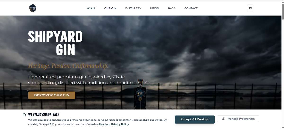
Shipyard Gin is a Scottish craft gin founded by Andy Samuel, inspired by the proud legacy of Clyde shipbuilding. Every batch honours the skilled workers who built some of the world’s greatest vessels on Scotland’s most famous river. The brand has won a gold medal at the London Spirits Competition and has a stated ambition to open a distillery on the banks of the River Clyde itself — a physical return to the landscape that inspired the gin. The visual identity uses a dark, maritime aesthetic that sets it apart from the floral and botanical styling of most Scottish gin brands.
What We Noticed
An origin story unlike any competitor’s
Scottish gin is dominated by a particular kind of provenance. Islands. Botanicals. Windswept coastlines. Wild herbs foraged by hand. The Botanist has Islay. Isle of Harris Gin has the Outer Hebrides. Eden Mill has St Andrews. These are beautiful narratives, but they trade on the same currency: nature, remoteness, and the romance of place. Shipyard Gin stands apart because its provenance is industrial, not pastoral. It is named after workers, not wildflowers. The Clyde shipyards built the Queen Mary, the Queen Elizabeth, and hundreds of vessels that shaped global trade. That is a story with weight, emotion, and historical significance. On the website, this narrative is present but not staged. It reads as brand copy rather than as the central argument for why Shipyard Gin exists. The origin story is the brand’s strongest competitive advantage, and it deserves more room to breathe.
The distillery vision that sits below the fold
Andy Samuel plans to build a distillery on the River Clyde. This is not just a business expansion — it is the narrative completion of the brand’s entire promise. A gin inspired by shipbuilding, distilled on the river where the ships were built. This kind of future vision is the material of community investment, media coverage, and customer loyalty built on being part of something. But on the current site, the distillery plans are not prominently positioned. A first-time visitor scrolling through the homepage may never reach them. In a category where distillery experiences drive tourism and brand affinity (The Botanist’s Islay distillery, Eden Mill’s St Andrews visitor centre), Shipyard’s distillery ambition should be a headline, not a footnote.
Friction before the first sip
The site opens with an age verification gate followed by cookie consent — two interaction barriers before the visitor sees any content. Age gates are a legal requirement for spirits brands in many contexts, but the execution matters. A smooth, branded overlay that feels like part of the experience is different from a generic popup that feels like a roadblock. For Shipyard, where the dark maritime aesthetic is a genuine brand asset, the age gate should carry the same visual language as the rest of the site. Currently, it breaks the mood before it has a chance to build.
What Works
The dark maritime aesthetic is a genuine differentiator in the gin category. Where most gin brands default to clean whites, soft botanicals, and lifestyle photography, Shipyard uses deep blacks, moody tones, and industrial textures. This visual language immediately communicates a different kind of gin — one that trades on heritage and craft rather than gardens and gentility. The aesthetic is distinctive enough to be recognisable across touchpoints.
The gold medal at the London Spirits Competition validates the liquid. In a market where new gin brands launch weekly, competition medals provide external credibility that marketing claims cannot match. It tells a retailer, a bartender, and a consumer that judges who taste hundreds of spirits found this one worth recognising.
Andy Samuel’s personal connection to the brand adds authenticity. A founder inspired by his own relationship to the Clyde and its industrial heritage is a more compelling story than a brand reverse-engineered from market research. The personal stake shows in the distillery ambition — this is not a scale-up play but a return to a place that matters.
The Wider Pattern
Across the food and drink brands we have reviewed, the most compelling stories are often the least prominently told. Gail’s Bakery never mentions 130 locations. Yorkshire Pasta Company buries endorsements from James Martin and Gennaro Contaldo in homepage clutter. Shipyard Gin has a founding story rooted in industrial heritage — something genuinely rare in a market saturated with botanical pastoralism — and a future vision of building a distillery on the Clyde. Both are present on the site. Neither is given the staging that the story demands. The pattern is consistent: brands with distinctive narratives present them as supporting content rather than as the reason to pay attention.
If We Were Starting Fresh
We would build the entire digital experience around two anchors: where the gin came from and where it is going.
The Clyde shipbuilding story would become the opening sequence. Not just a paragraph about heritage, but a visual narrative — archival photography of the shipyards, the workers, the vessels they built. The connection between that industrial craft and the craft of distilling gin. The website should feel like standing on the riverbank, looking at history and understanding why this gin carries that name.
The distillery vision would sit alongside the products as a parallel story. A timeline. A commitment. A way for customers to follow the journey and feel invested. Pre-registration for the opening, construction updates, and the story of how the building takes shape on the river. Brands like BrewDog built extraordinary community engagement by inviting customers into the growth story. Shipyard has a more compelling version of that invitation and is not yet using it.
The age gate would carry the brand’s visual language — dark, maritime, confident — so the first interaction sets the tone rather than interrupting it.
Wondering if YOUR brand has the same gaps?
We will tell you -- for free. Our team will analyse your website and brand, then send you an honest review.
Get Your Brand ReviewFeature Your Review
Display this badge on your website to showcase your independent brand review.

